可以使用ActionScript創建可重用的組件,並且在你的Flex程式中可以作為標籤引用這個組件。在ActionScript中創建的組件能夠包含圖像元素,自定義業務邏輯,或者擴展已經存在的Flex組件。
在ActionScript中,Flex組件實現了類層次結構。每一個組件,都是Action類的實例。下圖展示了這種層次結構的一部分。
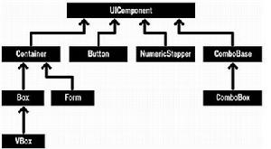 圖
圖所有Flex可視組件都是源自於UIComponent類。要創建自己的組件,你可以創建一個繼承UIComponent的類,或者繼承UIComponent子類的類。
使用類作為自定義組件的超類,取決於你要實現的功能。例如,你或許需要一個自定義的按鈕控制項。你可以創建一個UIComponent類的子類,然後重寫Flex Button 類的所有功能。更好更快創建自定義按鈕組建的方法是創建一個Flex Button組件的子類,然後在自定義類中進行修改。
創建一個簡單的ActionScript組件
引用自定義組件的屬性和方法
為自定義組件套用樣式
創建一個高級的ActionScript組件
創建一個複合ActionScript組件
連結:你可以在MXML中創建自定義組件。更多的信息,參看Building components in MXML Quick Start.
創建一個簡單的ActionScript組件
當你要在ActionScript 中定義一個組件時,不要創建一個組件,而是修改一個已經存在的組件的行為。在下邊的例子中,創建一個ComboBox類的子類,來創建一個自定義的ComboBox,命名為CountryComboBox——重新組裝的國家列表。
注意:在MXML中實例化你的組件,要使用類名作為標籤名。
你可以放置自定義組件在項目的根目錄或者子目錄中。Adobe推薦後者。在這個例子中,自定義被放置在叫做components的子資料夾中,在ActionScript相當於components包。在主應用程式的MXML檔案中,映射這個資料夾的命名空間為custom,並且使用完全合格的標籤名<custom:CountryComboBox>來引用這個組件。
注意:在真實世界的應用程式中,你可能會看到自定義組件被放置在倒置的域名結構的包結構中(例如:xmlns:custom=”com.adobe.quickstarts.customcomponents.*”)。這種習慣可以避免命名空間衝突,當不同的製造商,使用相同的名字。例如,在你的應用程式中,2個組件庫也許都含有Map組件,如果一個在com.vendorA包中另一個在com.vendorB包中,那么他們就不會起衝突
例子
components/CountryComboBox.as
package components
{
import mx.controls.ComboBox;
public class CountryComboBox extends ComboBox
{
public function CountryComboBox()
{
dataProvider = [ "United States", "United Kingdom" ];
}
}
}
應用程式MXML檔案
<?xml version="1.0" encoding="utf-8"?>
<mx:Application
xmlns:mx="http://www.adobe.com/2006/mxml"
xmlns:custom="components.*"
width="220" height="115"
>
<custom:CountryComboBox />
</mx:Application>
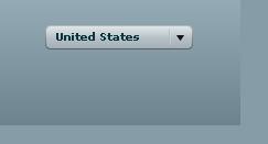 結果
結果引用自定義組件的屬性和方法
CountryComboBox類繼承了ComboBox類,所以能夠在初始化自定義組件的MXML標籤中或者在<mx:Script>標籤中的ActionScript中,引用所有屬性和方法。下邊的例子指定了rowCount屬性,並且為自定義組件的close事件指定了監聽器。
例子
components/CountryComboBox.as
package components
{
import mx.controls.ComboBox;
public class CountryComboBox extends ComboBox
{
public function CountryComboBox ()
{
dataProvider = [ "United States", "United Kingdom" ];
}
}
}
應用程式MXML檔案
<?xml version="1.0" encoding="utf-8"?>
<mx:Application
xmlns:mx="http://www.adobe.com/2006/mxml"
xmlns:custom="components.*"
width="270" height="170"
>
<mx:Script>
<![CDATA[
import flash.events.Event;
private function handleCloseEvent(eventObj:Event):void
{
status.text = "You selected: \r" + countries.selectedItem as String;
}
]]>
</mx:Script>
<mx:Panel
title="Custom component inheritance"
paddingTop="10" paddingBottom="10" paddingLeft="10" paddingRight="10"
>
<custom:CountryComboBox
id="countries" rowCount="5"
close="handleCloseEvent(event);"
/>
<mx:Text id="status" text="Please select a country from the list above." width="136"/>
</mx:Panel>
</mx:Application>
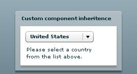 結果
結果為自定義組件套用樣式
Style 屬性定義了一個組件的感觀,從字型大小到背景顏色。自定義的ActionScript組件繼承了超類的所有樣式,所以你也可以使用同樣的方式來設定樣式。
要在自定義組件中改變樣式屬性,可以在組件構造器中使用setStyle()方法。這樣會套用相同的樣式到所有的組件的實例中,但是組件的用戶可以在MXML標記中覆蓋setStyle()方法設定的樣式。所有在組件類檔案中為設定的樣式均從超類繼承。
在下邊的例子中,創建了一個PaddedPanel自定義組件,它擴展了Panel組件,並且在組件四周一律使用10像素的邊白。使用這個自定義組件,比每次使用Panel組件都要設定4個樣式屬性(paddingLeft, paddingRight, paddingTop, and paddingBottom)更簡單,也就是說,結果是更少的編碼,沒有重複勞動。
例子
components/PaddedPanel.as
package components
{
import mx.containers.Panel;
public class PaddedPanel extends Panel
{
public function PaddedPanel()
{
// Call the constructor of the superclass.
super();
// Give the panel a uniform 10-pixel
// padding on all four sides.
setStyle("paddingLeft", 10);
setStyle("paddingRight", 10);
setStyle("paddingTop", 10);
setStyle("paddingBottom", 10);
}
}
}
應用程式MXML檔案
<?xml version="1.0" encoding="utf-8"?>
<mx:Application
xmlns:mx="http://www.adobe.com/2006/mxml"
xmlns:custom="components.*"
width="300" height="130"
>
<custom:PaddedPanel title="Custom component styles">
<mx:Text text="This is a padded panel component."/>
</custom:PaddedPanel>
</mx:Application>
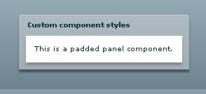 結果
結果創建一個高級的ActionScript組件
當使用ActionScript組件的普遍目的是創建可配置和可重用的組件。例如,創建一個ActionScript組件,它帶有屬性,分發時間,定義了新的樣式,具有自定義的皮膚,或其他的個性化的設定。
當創建一個自定的ActionScript組件時,一個設計上要考慮的事情是可重用性。也就是說,你希望創建一個緊緊的綁定帶你的應用程式的組件,還是能夠在多個套用中可重用的組件?
編寫與特定應用程式緊耦合的組件,經常是組件依賴於應用程式的結構,變數名或其他細節。如果你改變了應用程式,你可能需要修改緊耦合的組件來反映這種變化。一個緊耦合的組件,在沒有重寫的情況下很難套用到其他應用程式中。
設計一個松耦合的組件用於重用。松耦合的組件需要有清晰可辨的接口來指定如何向組件傳遞信息,如何將將結果傳回應用程式。
典型的松耦合組件是使用屬性來向組件傳遞信息。這些屬性通過默認存取器(setter和getter方法)來定義,指定參數的類型。在下邊的例子中,CountryComboBox自定義組件定義了公共的userShortNames屬性,此屬性通過使用get userShortNames()和set useShortNames()存取器方法暴露_ userShortNames私有屬性。
私有屬性_userShortNames的Inspectable 元數據標籤定義了一個特性,這個特性出現在Adobe? Flex? Builder?中的屬性提示和標籤內省器中。也可以使用這個元數據標籤限制允許的屬性值。
注意:所有公共屬性出現在MXML的代碼提示和屬性檢查器中。如果你有關於屬性的額外的信息,這些信息能夠幫助代碼提示或屬性檢查器(像枚舉型的值,或這個字元串實際是檔案路徑),那么也把額外的信息添加到[Inspectable]元數據中。
MXML代碼提示和屬性檢查器來於相同的數據,所以,如果在一個中顯示出來那么在另一個中也應該一直顯示出來。
在另一方面,ActionScript代碼提示,不需要元數據也可以正常工作,所以你在ActionScript中依據所在的上下文一直都可以看待適當的代碼提示。Flex Builder使用public/protected/private/static等等修飾符加當前所在範圍計算出ActionScript代碼提示。
定義組件向主應用程式返回信息的最佳實踐是設計組件分發事件,事件中包含要返回的數據。那樣,主函式能夠定義時間監聽器來處理時間,並且採取適當的行動。也可以使用數據綁定在事件中。在下邊的例子中,使用Bindable元數據標籤是userShortName編程一個被綁定的屬性。隱含的userShortName屬性的setter傳送改變事件,這個過程使用了的Flex 框架的內部的機制,來使數據綁定正常工作。
連線:有些文章比這個引導性的快速指南更多的描述關於在ActionScript中創建高級組件的套用。全面描述這一主題,可以查看” Creating Advanced Visual Components in ActionScript”在Creating and Extending Adobe Flex 3 Components.
例子
components/CountryComboBox.as
package components
{
import mx.controls.ComboBox;
import flash.events.Event;
public class CountryComboBox extends ComboBox
{
private var countryArrayShort:Array = ["US", "UK"];
private var countryArrayLong:Array = ["United States", "United Kingdom"];
// Determines display state. The inspectable metadata tag
// is used by Flex Builder 3.
[Inspectable(defaultValue=true)]
private var _useShortNames:Boolean = true;
// Implicit setter
public function set useShortNames(state:Boolean):void
{
// Call method to set the dataProvider based on the name length.
_useShortNames = state;
if (state)
{
this.dataProvider = countryArrayShort;
}
else
{
this.dataProvider = countryArrayLong;
}
// Dispatch an event when the value changes
// (used in data binding).
dispatchEvent(new Event("changeUseShortNames"));
}
// Allow other components to bind to this property
[Bindable(event="changeUseShortNames")]
public function get useShortNames():Boolean
{
return _useShortNames;
}
}
}
應用程式 MXML檔案
<?xml version="1.0" encoding="utf-8"?>
<mx:Application
xmlns:mx="http://www.adobe.com/2006/mxml"
xmlns:custom="components.*"
viewSourceURL="src/MxmlComponentAdvanced/index.html"
width="260" height="200"
>
<mx:Panel
title="Advanced custom components"
paddingTop="10" paddingBottom="10" paddingLeft="10" paddingRight="10"
>
<!-- Set a custom property on a custom component -->
<custom:CountryComboBox
id="countries"
useShortNames="false"
/>
<!--
Use data binding to display the latest state
of the property.
-->
<mx:Label text="useShortNames = {countries.useShortNames}"/>
<mx:ControlBar horizontalAlign="right">
<mx:Button
label="toggle Display"
click="countries.useShortNames = !countries.useShortNames;"
/>
</mx:ControlBar>
</mx:Panel>
</mx:Application>
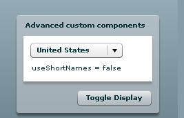 結果
結果創建複合 ActionScript 組件
例子
components/NumericDisplay.as
package components
{
import mx.containers.VBOX;
import mx.containers.tile;
import mx.controls.TextInput;
import mx.controls.Button;
import mx.events.FlexEvent;
import flash.events.Event;
import flash.events.MouseEvent;
public class NumericDisplay extends VBox
{
private var display:TextInput;
private var buttonsTile:Tile;
// Expose the _numButtons property to the
// visual design view in Flex Builder 3.
[Inspectable(defaultValue=10)]
private var _numButtons:uint = 10;
public function NumericDisplay()
{
addEventListener(FlexEvent.INITIALIZE, initializeHandler);
}
// numButtons is a public property that determines the
// number of buttons that is displayed
[Bindable(event="numButtonsChange")]
public function get numButtons():uint
{
return _numButtons;
}
public function set numButtons(value:uint):void
{
_numButtons = value;
dispatchEvent(new Event("numButtonsChange"));
}
// Gets called when the component has been initialized
private function initializeHandler(event:FlexEvent):void
{
// Display the component
paint();
}
// Add the label of the clicked button to the display
private function buttonClickHandler(event:MouseEvent):void
{
display.text += (event.target as Button).label;
}
// Display the component
private function paint():void
{
// Create the number display
display = new TextInput();
display.width=185;
addChild(display);
// Create a Tile container to
// hold the buttons.
buttonsTile = new Tile();
addChild (buttonsTile);
// Create the buttons and add them to
// the Tile container.
for (var i:uint = 0; i < _numButtons; i++)
{
var currentButton:Button = new Button();
currentButton.label = i.toString();
currentButton.addEventListener(MouseEvent.CLICK, buttonClickHandler);
buttonsTile.addChild (currentButton);
}
}
}
}
components/PaddedPanel.as
package components
{
import mx.containers.Panel;
public class PaddedPanel extends Panel
{
public function PaddedPanel()
{
// Call the constructor of the superclass.
super();
// Give the panel a uniform 10-pixel
// padding on all four sides.
setStyle ("paddingLeft", 10);
setStyle ("paddingRight", 10);
setStyle ("paddingTop", 10);
setStyle ("paddingBottom", 10);
}
}
}
應用程式 MXML 檔案
<?xml version="1.0" encoding="utf-8"?>
<mx:Application
xmlns:mx="http://www.adobe.com/2006/mxml"
xmlns:custom="components.*"
viewSourceURL="src/ASComponentComposite/index.html"
width="300" height="225"
>
<custom:PaddedPanel
title="Composite component"
>
<custom:NumericDisplay numButtons="10"/>
</custom:PaddedPanel>
</mx:Application>
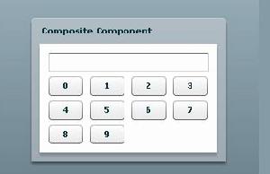 結果
結果